In a unique collaboration, a Colaba-based calligraphy studio crosses paths with the India Government Mint. The result is a sleek, mandala-inspired design for an exclusive series of commemorative coins

Sanjana Chatlani and the team at The Bombay Lettering Company envisioned a design rooted in Indian art, with a modern, young look
To the intrepid Indian collector, rare, exclusive coins issued by the government are a much-sought after item, whether they are issued in the name of personalities like Atal Bihari Vajpayee, or to mark events such as the 150th anniversary of the India Post. A series of such coins, which embodies the Ashtamangal auspicious symbols, is likely to pique the attention of a different type of hobbyist—the design aficionado.
ADVERTISEMENT
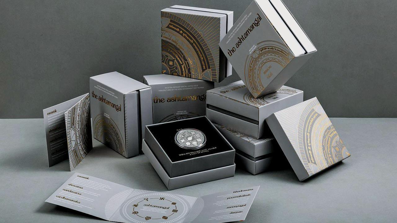
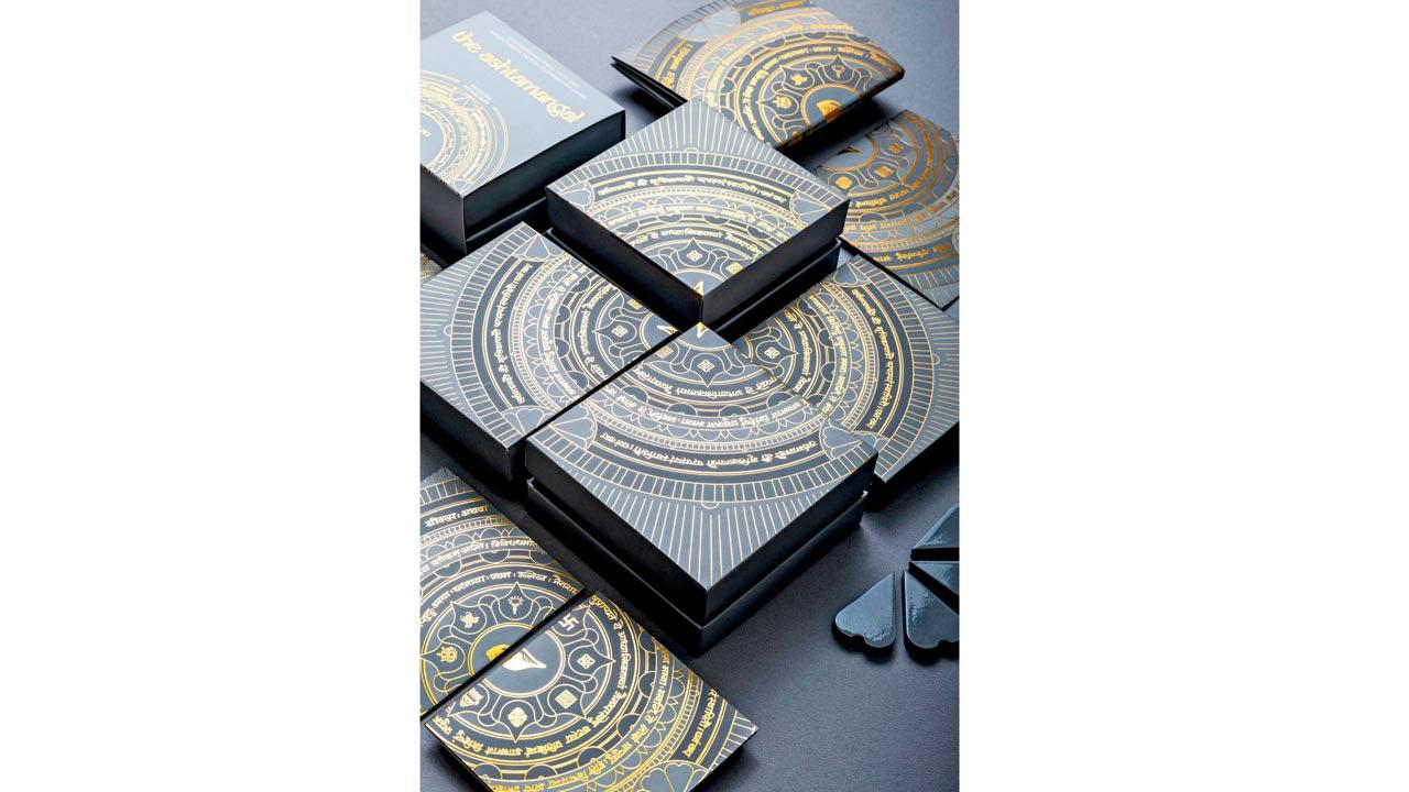
Bearing a swastika, a conch, and two golden fish, among other symbols, the coins are enveloped in packaging that gleams with gold foil and subtle grey hues. The intricate concentric circle designs, woven with Sanskrit lettering, are the labour of a boutique calligraphy studio tucked away in Colaba’s own Apollo Bandar.

Sanjana Chatlani, founder of The Bombay Lettering Company, recognised how special this project was for her studio, right from the initial conversations in June 2023. The packaging for the Ashtamangal series, due to be issued, was yet to be designed for the India Government Mint, Mumbai.
Thus began Chatlani and her studio’s education in how the Mint functions. “I also learnt a great deal about packaging design and construction—the amount of detail that goes into it, and the number of prototypes it can take,” says Chatlani, who started The Bombay Lettering Company in October 2017.
 Sanjana Chatlani
When she and her team began brainstorming, Chatlani happened to be in Nepal’s Kathmandu, where she was awed by traditional paintings—ones which featured concentric circles harmoniously coming together with elegant calligraphy. This nudged her to think of ways in which she, too, could add an element of calligraphy—the studio’s forte—to the packaging.
The coins are of two kinds, made in copper-nickel and pure silver. A thousand pieces will be issued of the former and 500 of the latter, which will be sold at a higher price and delivered in a box. “The copper-nickel one is packaged in the way that commemorative coins traditionally are, ensconced in a folder made of paper,” she says.
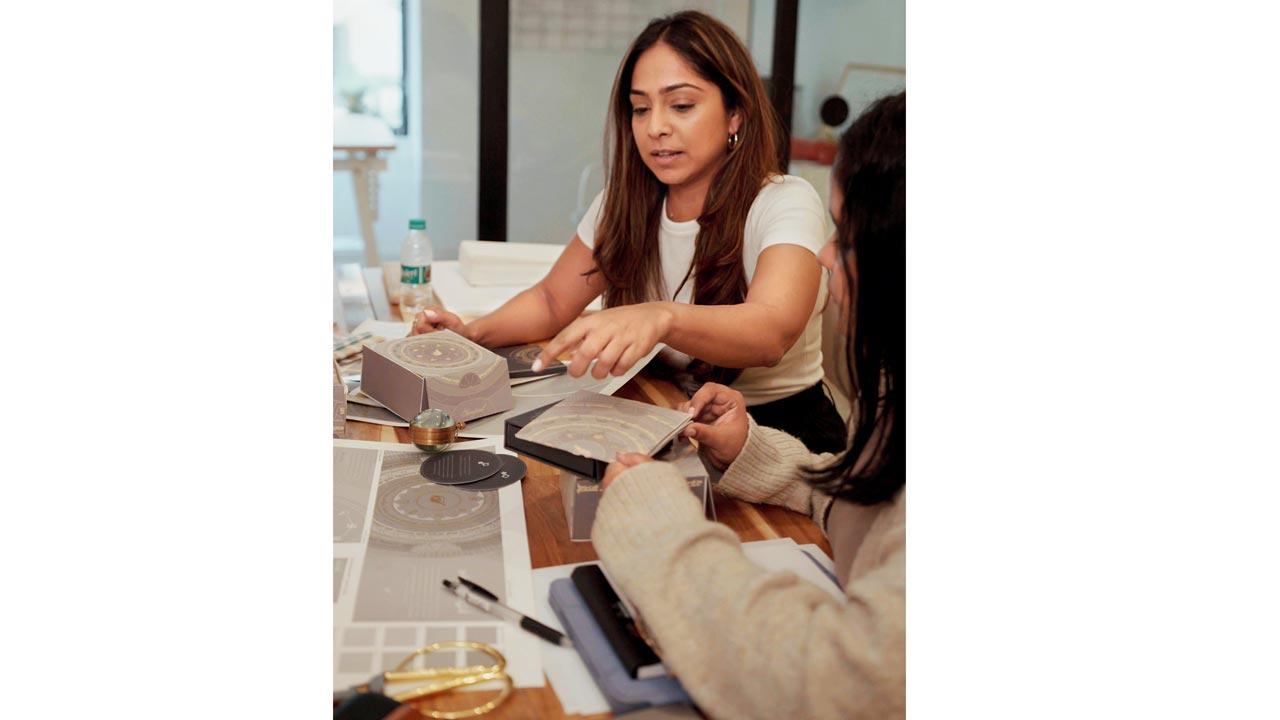
 Chatlani at work at her studio. She drew inspiration from her travels in Nepal for the coins’ packaging
As they created five different moodboards and approaches, they considered techniques like line drawing; the aesthetic they arrived at is one where knowledge about the Ashtamangal concept is contained within a mandala-inspired design. “Like Ashtamangal, even mandalas are in accordance with the number eight. It all came together in the design sense,” she says, adding that they wanted to invoke a contemporary, young feel rooted in Indian art forms.
The studio further committed itself to the project by bringing on board calligraphy expert Hemant Ravandale, a professor at Mumbai’s Sir JJ School of Art, who specialises in Sanskrit and Devanagari scripts. “He joined us in our studio for a couple of days, and on very large sheets of paper, we wrote out the text that went into the circle—it gives the buyer details about the symbols and their significance,” Chatlani explains.
A sense of play is inherent to the packaging’s design; each box for the silver coins contains only one part of the master mandala envisioned by the studio. It is when they are placed together that the buyer can see the concentric circles in their entirety. “Even in the folder for the copper-nickel coin, only half of it is visible until it is opened entirely,” Chatlani says.
As we dissect the design over a telephonic chat, the founder reminds us that the hero, ultimately, is still the coin—the packaging is but an invitation for the buyer to cherish it further. This thought guided the hues she picked. “We wanted the look to be metallic and neutral, picking grey and gold as a palette.“
 Subscribe today by clicking the link and stay updated with the latest news!" Click here!


